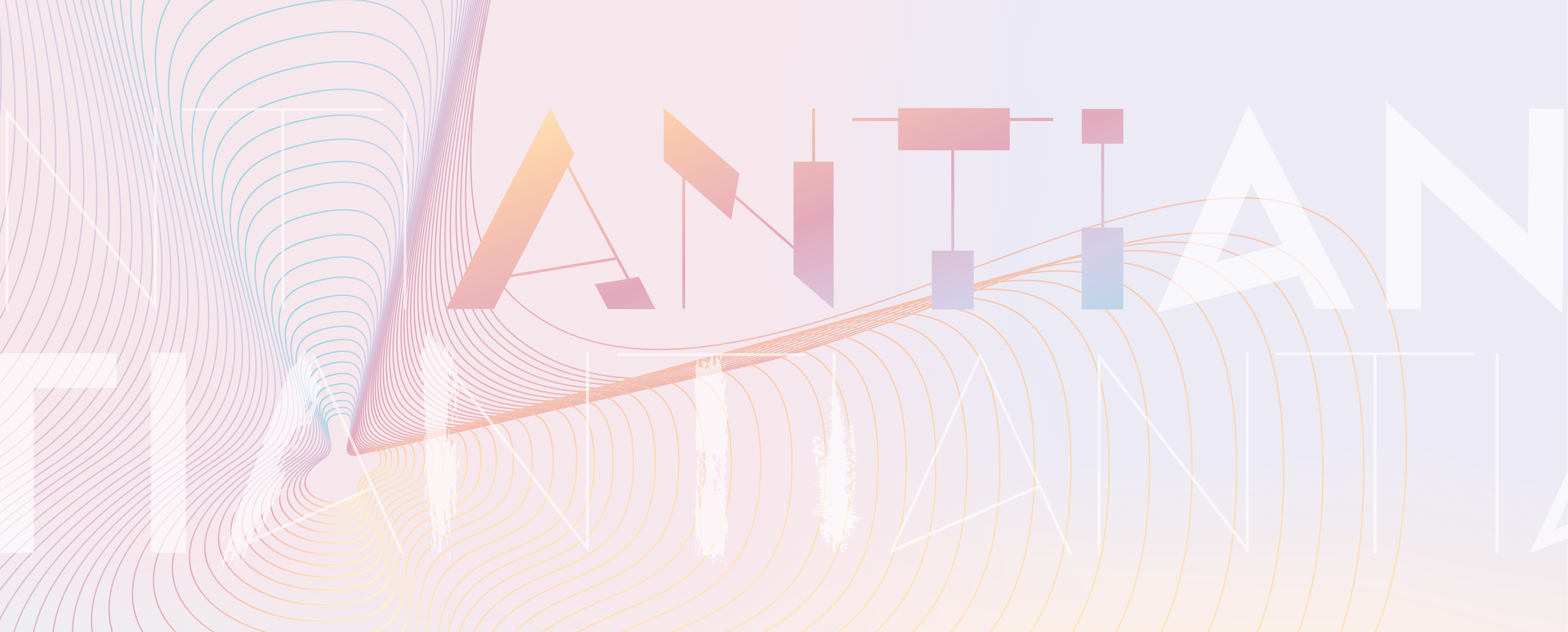
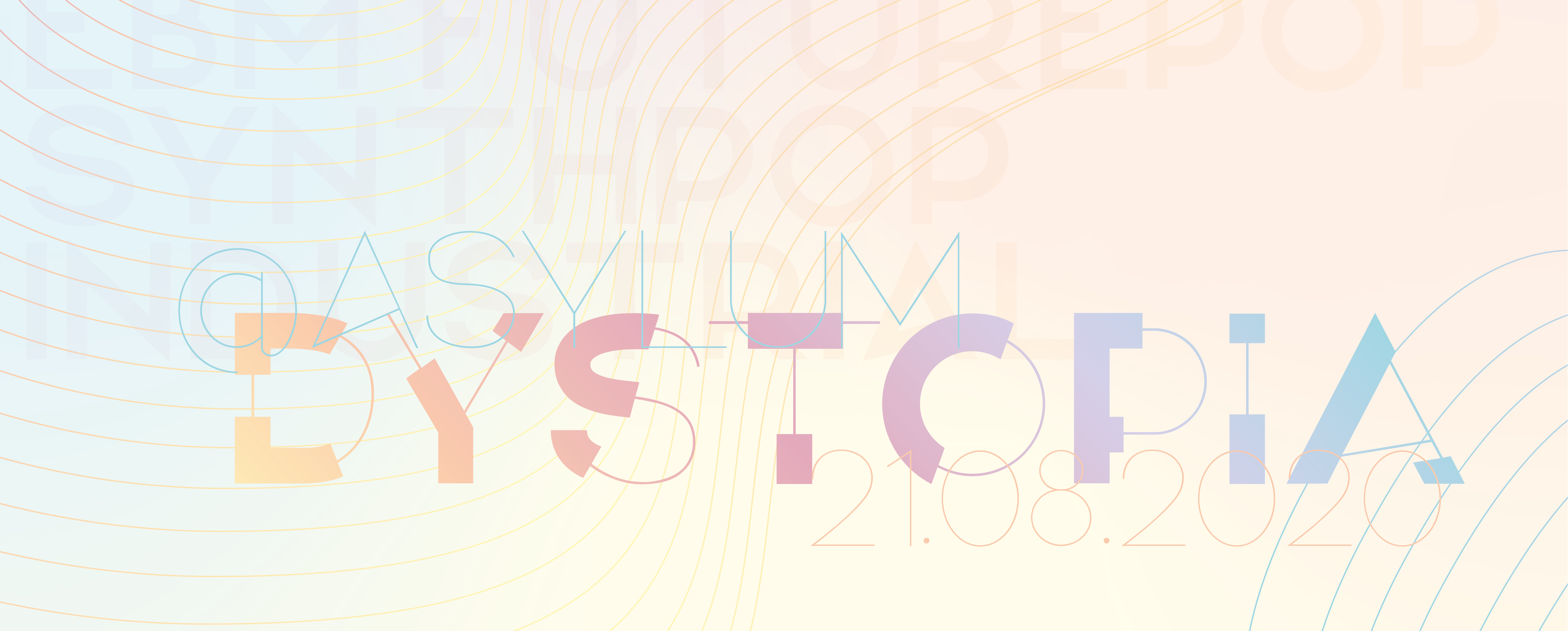
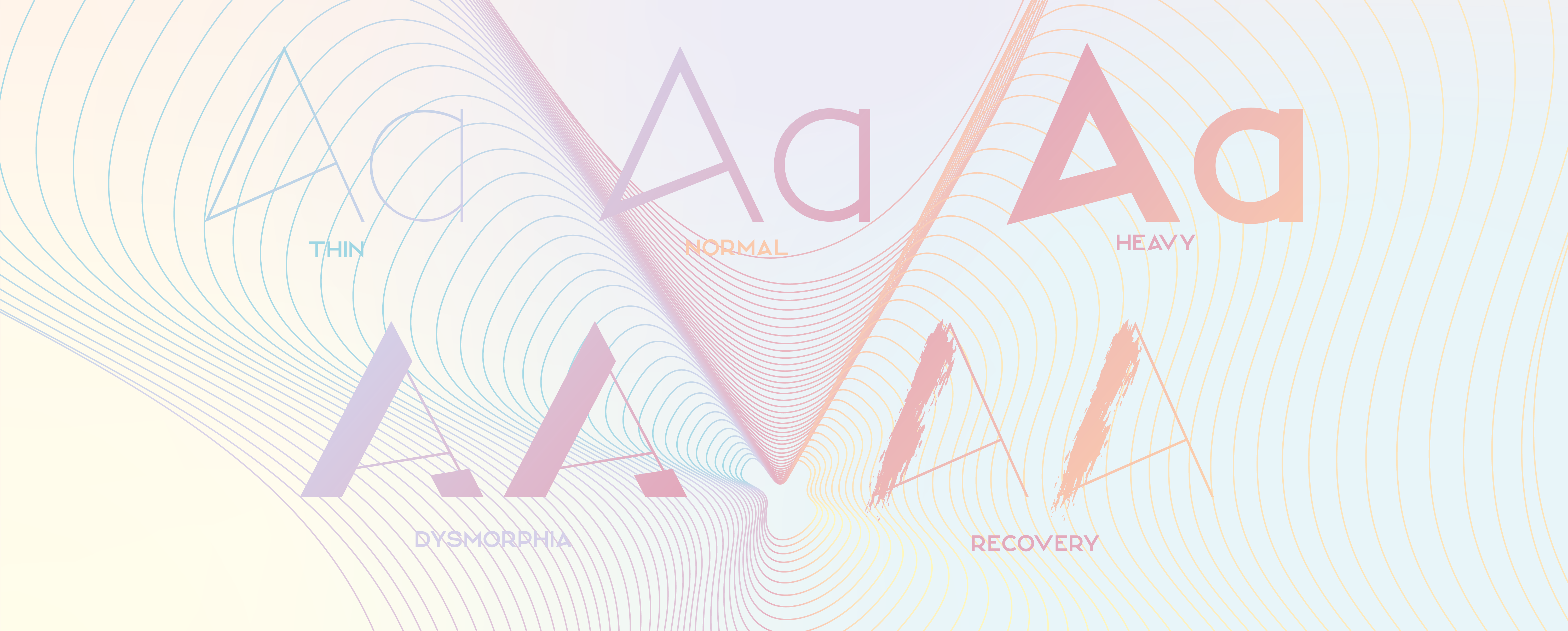
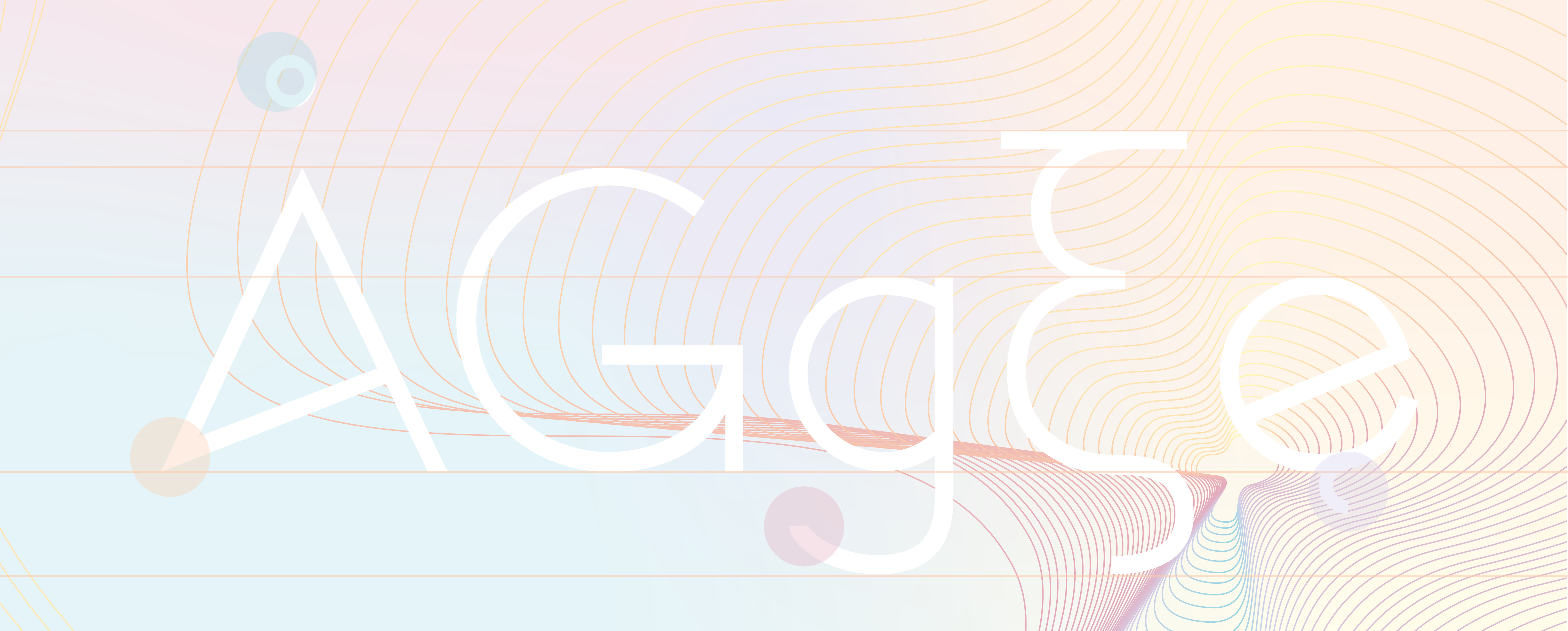
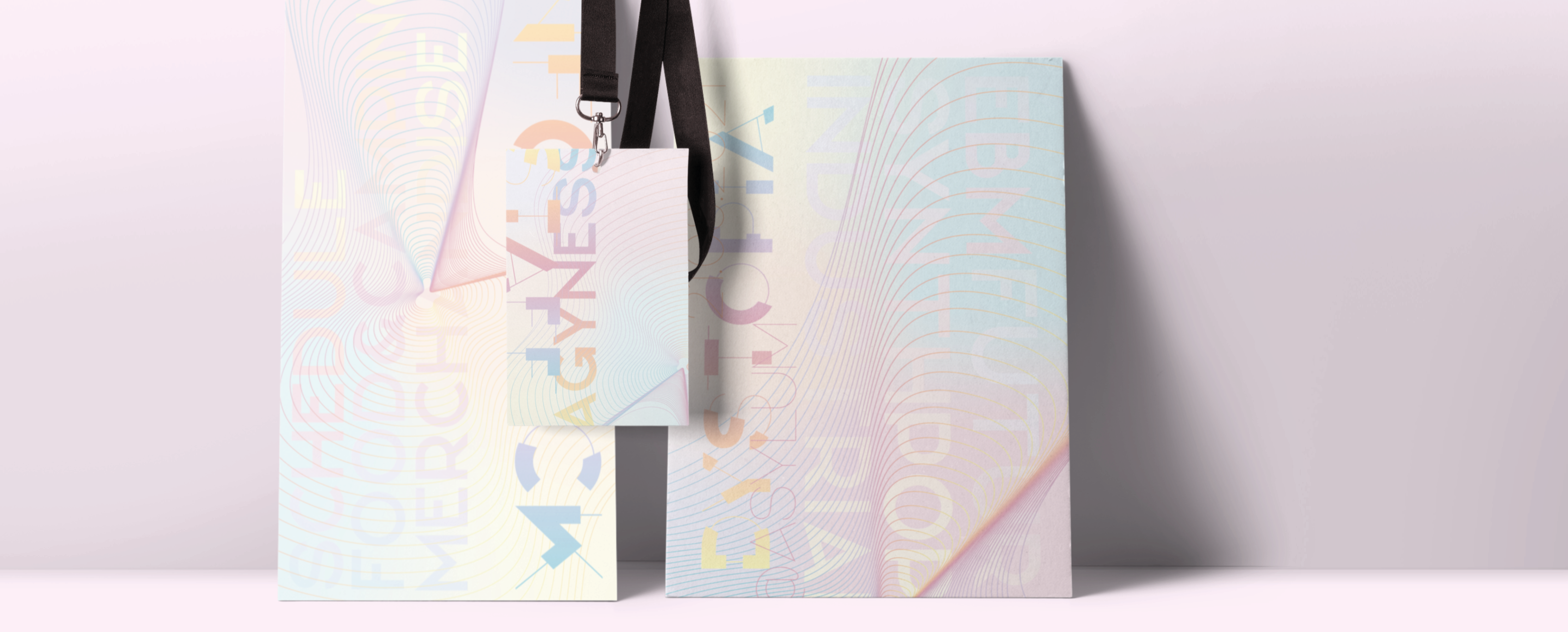
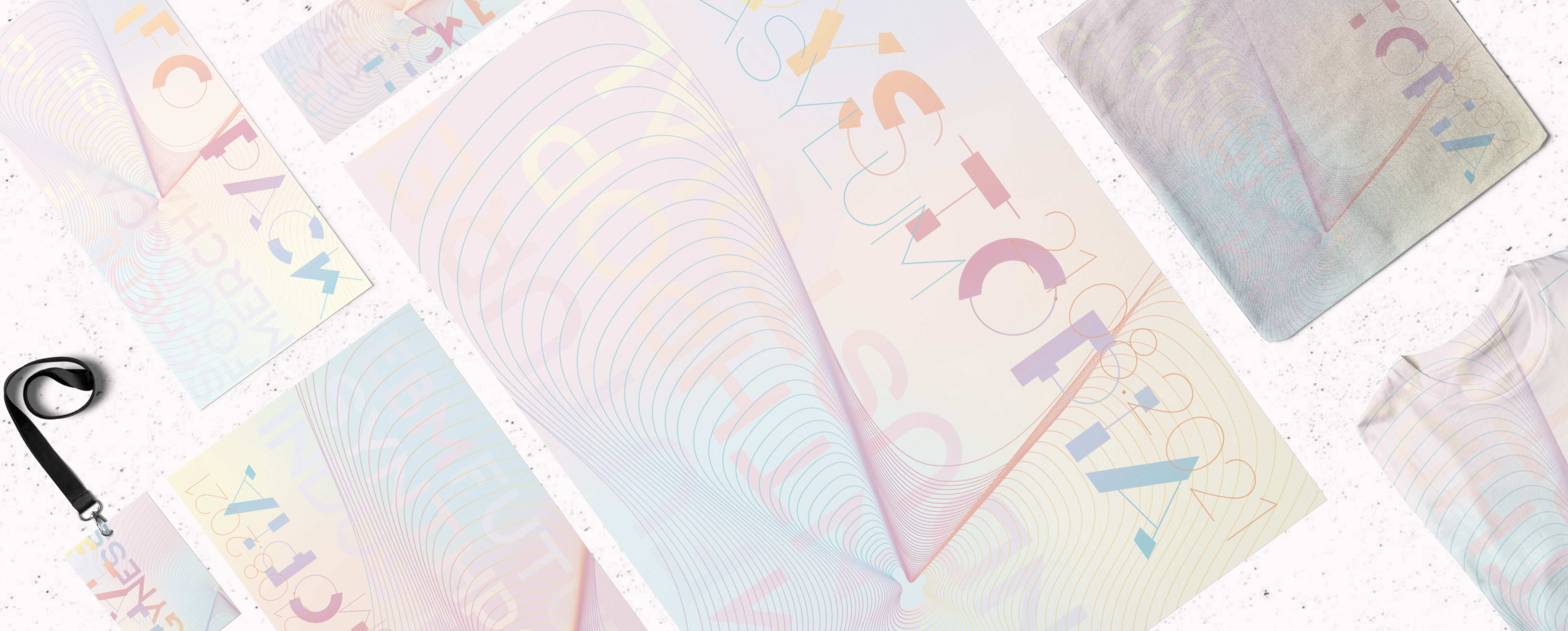

The unique and quirky design was developed when looking at how to represent eating disorders as letter forms. As both fonts and people have weights that was a start point. there are more conventional weights along with two that represent the psychological side of eating disorders.
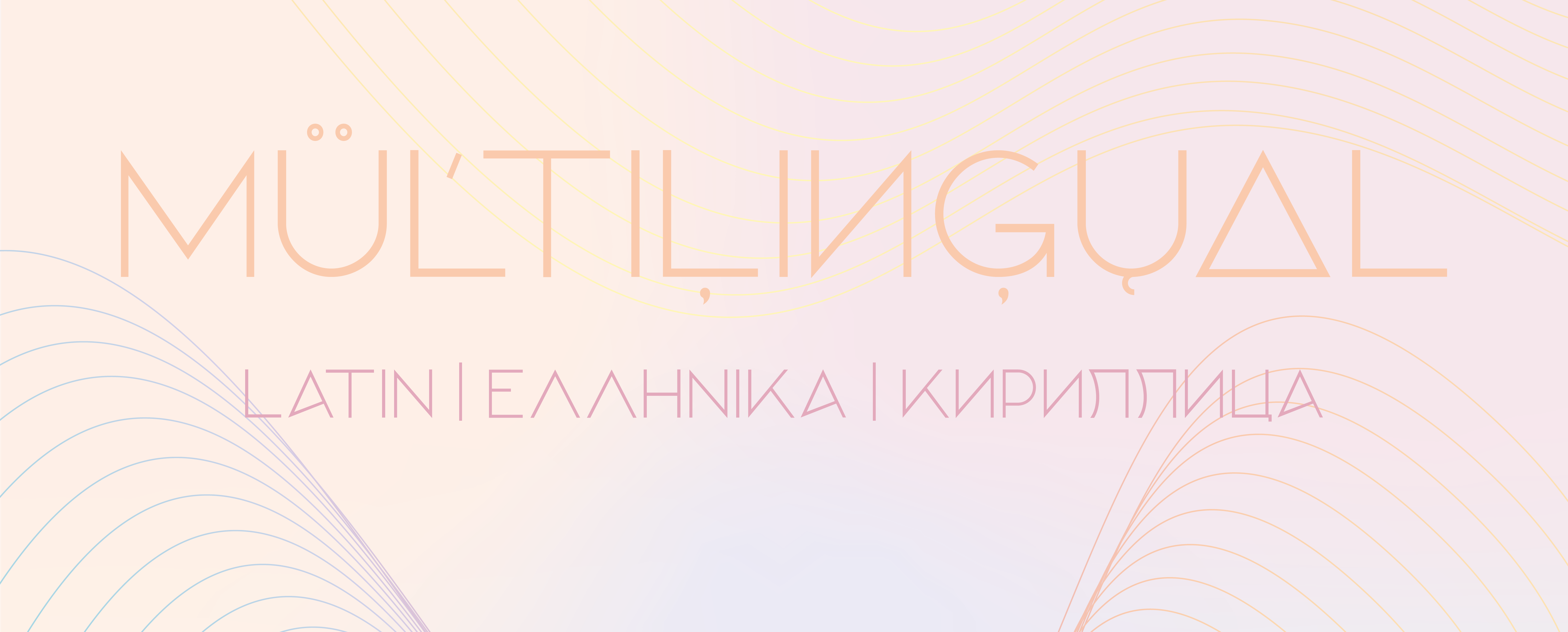
The family consists of 5 weights with Latin, Greek and Cyrillic scripts.
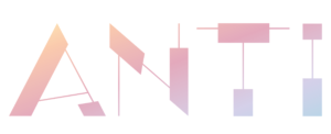
NAME: ANTI
STYLES: 6
GLYPH COUNT: 517
SCRIPTS: LATIN, GREEK & CYRILLIC
RELEASE DATE: SEPT 2020
DESIGNER: FIE CLARKE
EACH WEIGHT OF THE TYPEFACE CONSISTS OF 517 GLYPHS
LATIN COVERAGE
STANDARD A-Z
ACCENTED LETTERS
GREEK COVERAGE
STANDARD ALPHABET
LETTERS WITH TONOS AND ACCENTS
CYRILLIC COVERAGE
STANDARD ALPHABET
ACCENTED LETTERS
ADDITIONAL POPULAR LETTERS
NUMBERS & PUNCTUATION
ALL POPULAR CHARACTERS
If you come across a glyph that you need that hasnt yet been created feel free to drop me a line and i’ll add it in.
to see the individual glyphs in each script please refer to the pdf specimen
OTF
Keep up to date with the latest releases and exclusive discounts!
COPYRIGHT BONEZ DESIGNZ
BONEZ DESIGNZ IS A REGISTERED TRADEMARK
Sign up to our newsletter for 10% off your first order!
You’ll also be kept up to date with our latest releases and discounts. I promiose I wont spam you – I cant make fonts that quick :)