GENERAL
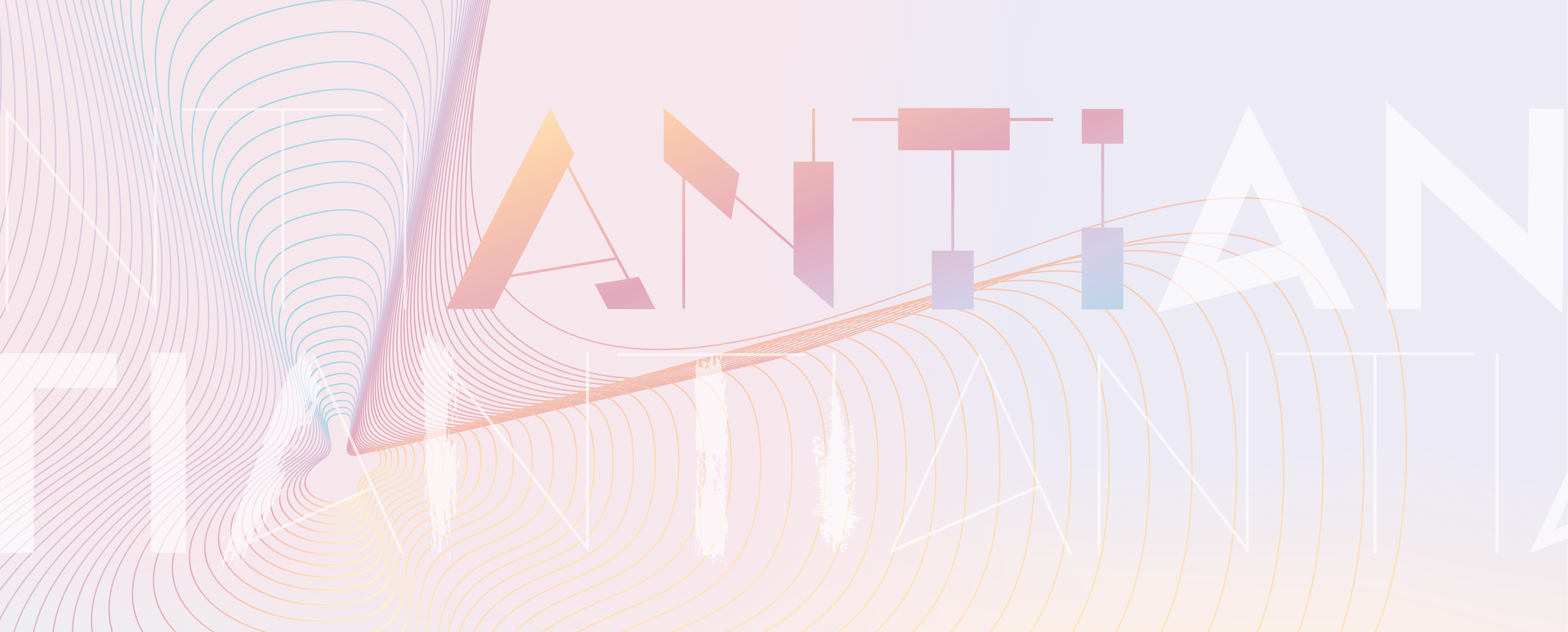
NAME: ANTI
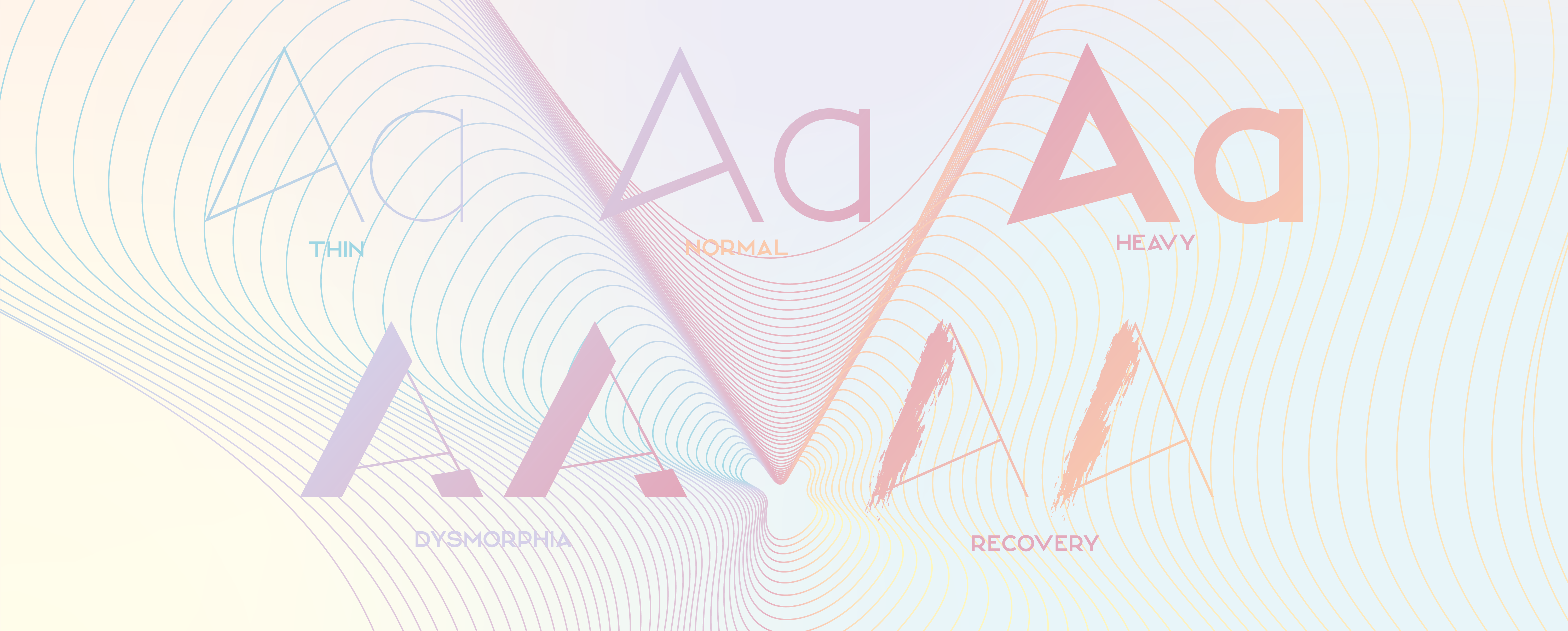
STYLES: 6
GLYPH COUNT: 517
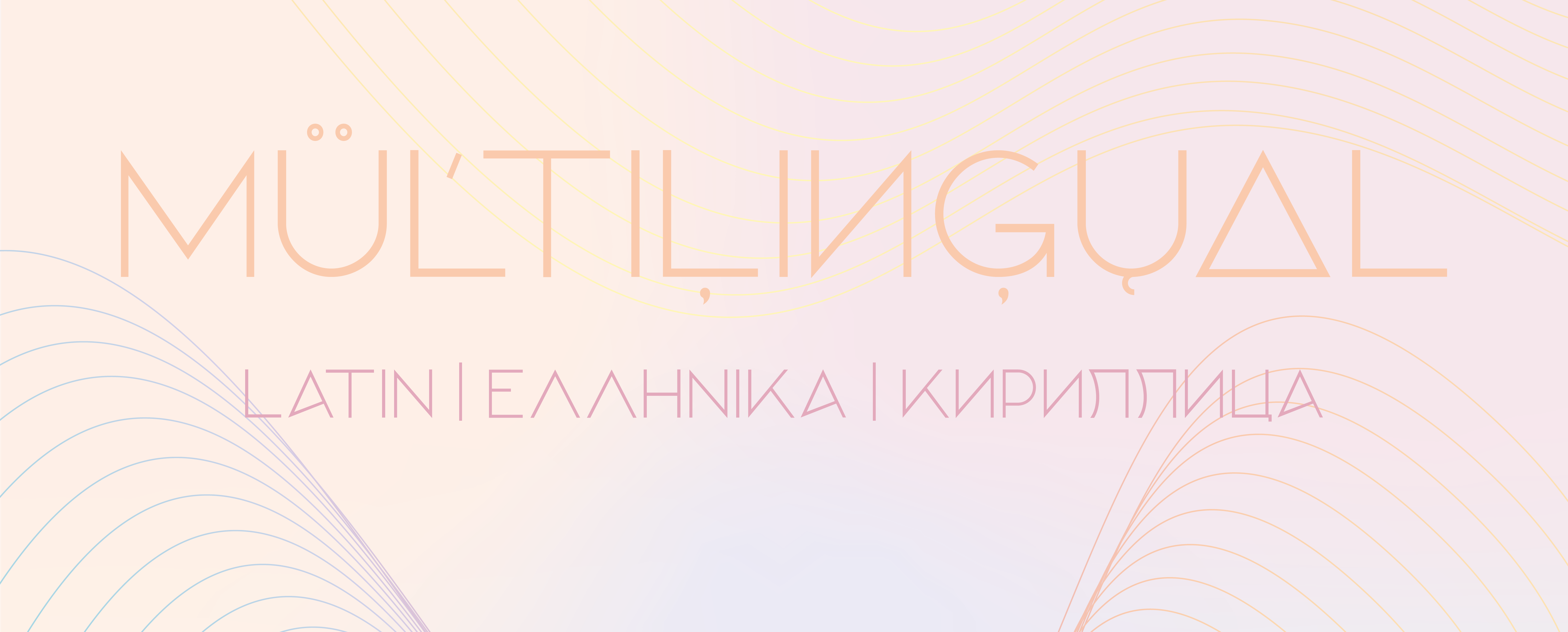
SCRIPTS: LATIN, GREEK & CYRILLIC
RELEASE DATE: SEPT 2020
DESIGNER: FIE CLARKE
GLYPHS
EACH WEIGHT OF THE TYPEFACE CONSISTS OF 517 GLYPHS
LATIN COVERAGE
STANDARD A-Z
ACCENTED LETTERS
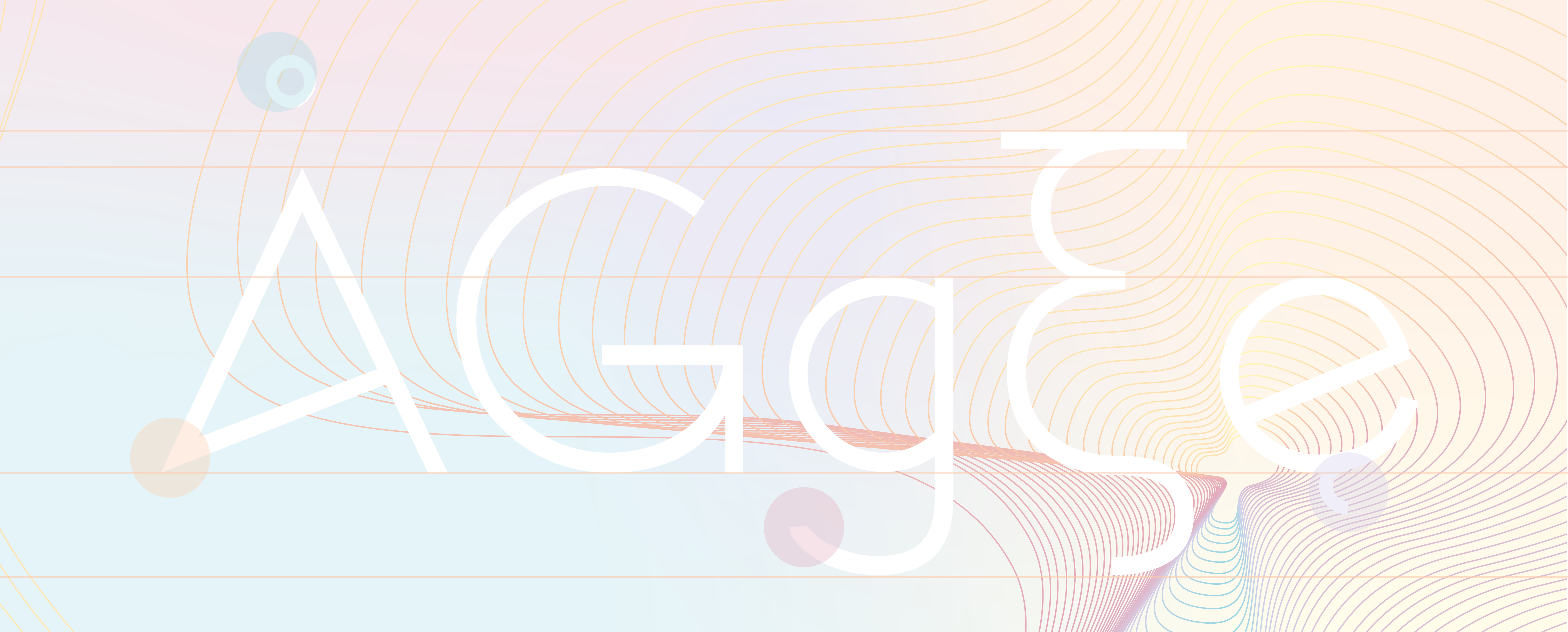
GREEK COVERAGE
STANDARD ALPHABET
LETTERS WITH TONOS AND ACCENTS
CYRILLIC COVERAGE
STANDARD ALPHABET
ACCENTED LETTERS
ADDITIONAL POPULAR LETTERS
NUMBERS & PUNCTUATION
ALL POPULAR CHARACTERS
If you come across a glyph that you need that hasnt yet been created feel free to drop me a line and i’ll add it in.
to see the individual glyphs in each script please refer to the pdf specimen
LANGUAGE SUPPORT
Afrikaans, Albanian, Asu, Basque, Belarusian, Bemba, Bena, Bosnian, Bulgarian, Catalan, Cebuano, Chiga, Colognian, Cornish, Corsican, Croatian, Czech, Danish, Dutch, English, Erzya, Estonian, Faroese, Filipino, Finnish, French, Friulian, Galician, Ganda, German, Greek, Gusii, Hungarian, Icelandic, Ido, Inari Sami, Indonesian, Interlingua, Irish, Italian, Javanese, Jju, Jola-Fonyi, Kabuverdianu, Kalenjin, Kinyarwanda, Kurdish, Latvian, Lithuanian, Lojban, Low German, Lower Sorbian, Luo, Luxembourgish, Luyia, Macedonian, Machame, Makhuwa-Meetto, Makonde, Malagasy, Malay, Maltese, Manx, Maori, Morisyen, North Ndebele, Northern Sami, Northern Sotho, Norwegian Bokmål, Norwegian Nynorsk, Nyanja, Nyankole, Occitan, Oromo, Polish, Portuguese, Romanian, Romansh, Rombo, Rundi, Russian, Rwa, Samburu, Sango, Sangu, Sardinian, Scottish Gaelic, Sena, Serbian, Shambala, Shona, Slovak, Slovenian, Soga, Somali, South Ndebele, Southern Sotho, Spanish, Swahili, Swati, Swedish, Swiss German, Taita, Taroko, Teso, Tsonga, Tswana, Turkish, Turkmen, Upper Sorbian, Vunjo, Walloon, Welsh, Western Frisian, Wolof, Xhosa, Zulu
FORMATS